Living in a fast-paced world with a million different distractions, many of us found ourselves struggling to remember important dates, choose the right gifts for the important ones at the very last minute, and overspend money and time on gifts… Gift-giving can also be incredibly stressful when the to-do list is endless and when there is not enough time to put time and thought into the present. Gift-giving anxiety is largely common, and with festive spending on the rise, it is an anxiety that is growing.
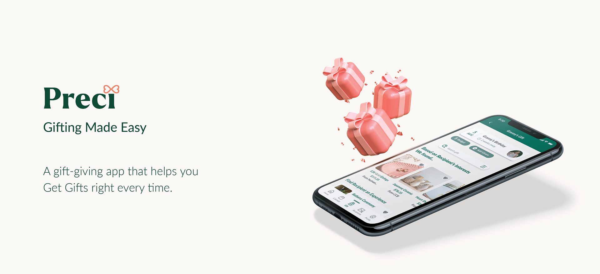
Gift-giving should be an exciting and pleasant experience and helps to define relationships and strengthen bonds with family and friends. I have spent some time researching, designing, and developing Preci, a gift-giving app designed to help everyone find the best way to express their love language.
Project Duration
12 Weeks
Process
User Research & Synthesize
Ideation
Sketch
UI Design & Prototype
Usability Test & Synthesize
Redesign
My Role
UX Research, UX Design, UI Design
Tools
Figma
Sketch
Miro
Invision
Project Summary
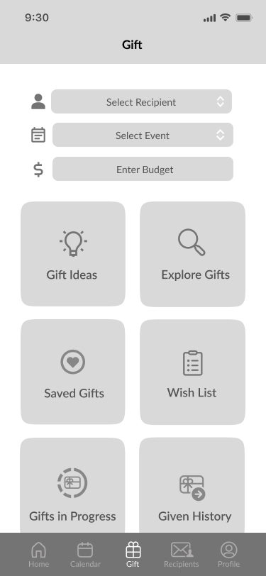
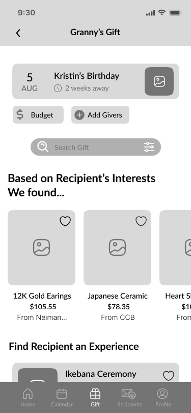
Preci is a gift-giving app meant to inspire and encourage creative gift-giving as a personal assistant who truly cares about people. By providing curated gift picks, offering the best price option, and other personalized services, Perci helps users to find the best way to curate the most suitable gifts while saving expenses.
The Challenge
We often find ourselves having experienced gift-giving anxiety: it could be time-consuming to buy or make a gift for a special event ahead of time. Having a busy life, many of us have also found ourselves forgetting an important date— perhaps a birthday, anniversary, important milestone, etc.
We rely on the Calendar app, Google Calendar, and Facebook Events to remind ourselves of special occasions, however, we may still struggle to pull things together and find the ideal gift at the last minute. We end up overspending on gifts that are not as memorable.
The Solution
I created Preci to provide modern tools that make it easy for everyone to curate the most suitable gifts while saving expenses. Preci’s purpose is to inspire and encourage creative gift-giving as a personal assistant who truly cares about people. By curating gift picks, offering the best price option, and other personalized services, Perci helps users to find the best way to express their appreciation and love.
Click to Start or view Figma Prototype
1. User Research & Synthesize
Secondary Research
Through my secondary research, I realize that it is quite common that people always feel that buying presents is hard work: hard on the feet, hard on the bank account, and hard on the emotions. Status has shown that a large percentage of Americans have failed to prepare gifts for their significant others. There are a couple of reasons why people overspent their money, time, and energy on gifts. According to BBC(https://www.bbc.com/worklife/article/20191206-the-science-behind-giving-good-gifts; https://www.bbc.com/worklife/article/20191121-why-do-we-spend-so-much-money), CNBC(https://www.cnbc.com/select/millennials-overspending-during-holidays/), and New York Times (https://www.nytimes.com/2021/12/09/opinion/letters/holiday-gift-giving.html):
· Gift-giving usually communicates feelings toward the receiver and strengthens relationships, yet, a less-than-stellar gift can have the opposite effect.
· Social expectations can also influence when and why we spend more on gifts
· Did not plan and prepare gifts in advance.
Primary Research
To get insight as to how users acquire their information about shopping for gifts and their gift-giving process, I used screener surveys to recruit participants, after interviewing them and collecting more data I was able to synthesize my findings into affinity groups, empathy maps, and personas.
Surveys
When creating the screener survey the main objective was to find participants who have had difficulty with gift-giving as well as those who found gift-giving enjoyable, participants who have lost interest over time due to lack of knowledge, and those who do not know how to properly care for houseplants. I distributed the survey through social media and email lists, and here are the results I received from 34 participants.

Interview
In order to get a better understanding of how users would find the right information with current or past problems, I then conducted remote/ virtual interviews with 5 participants who fit the demographics. I focused on every participant’s gift-giving experience including their gift shopping experience.
Guiding questions:
· If you need to prepare gifts, how long in advance would you start preparing?
· Do you usually shop gifts online or visit stores in real life?
· Can you tell me more about your experience of spending an unexpected amount of time/effort/ money on gifts?
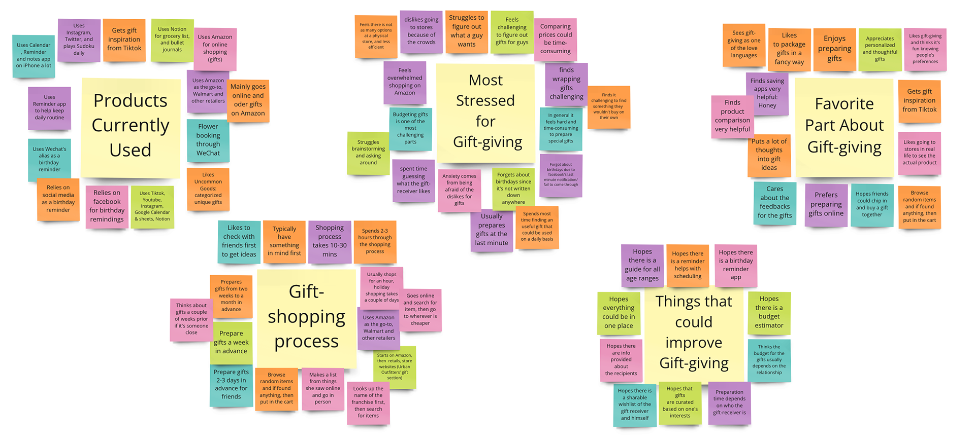
Affinity Mapping
With my interviews, I generated the affinity maps with 104 sticky notes abstracted from the interviews. And I was able to narrow it down to five main categories: these included their current consuming habit, their stressed/ enjoyable gift-giving experience, their gift-shopping process and things that they wish could be improved through the process.
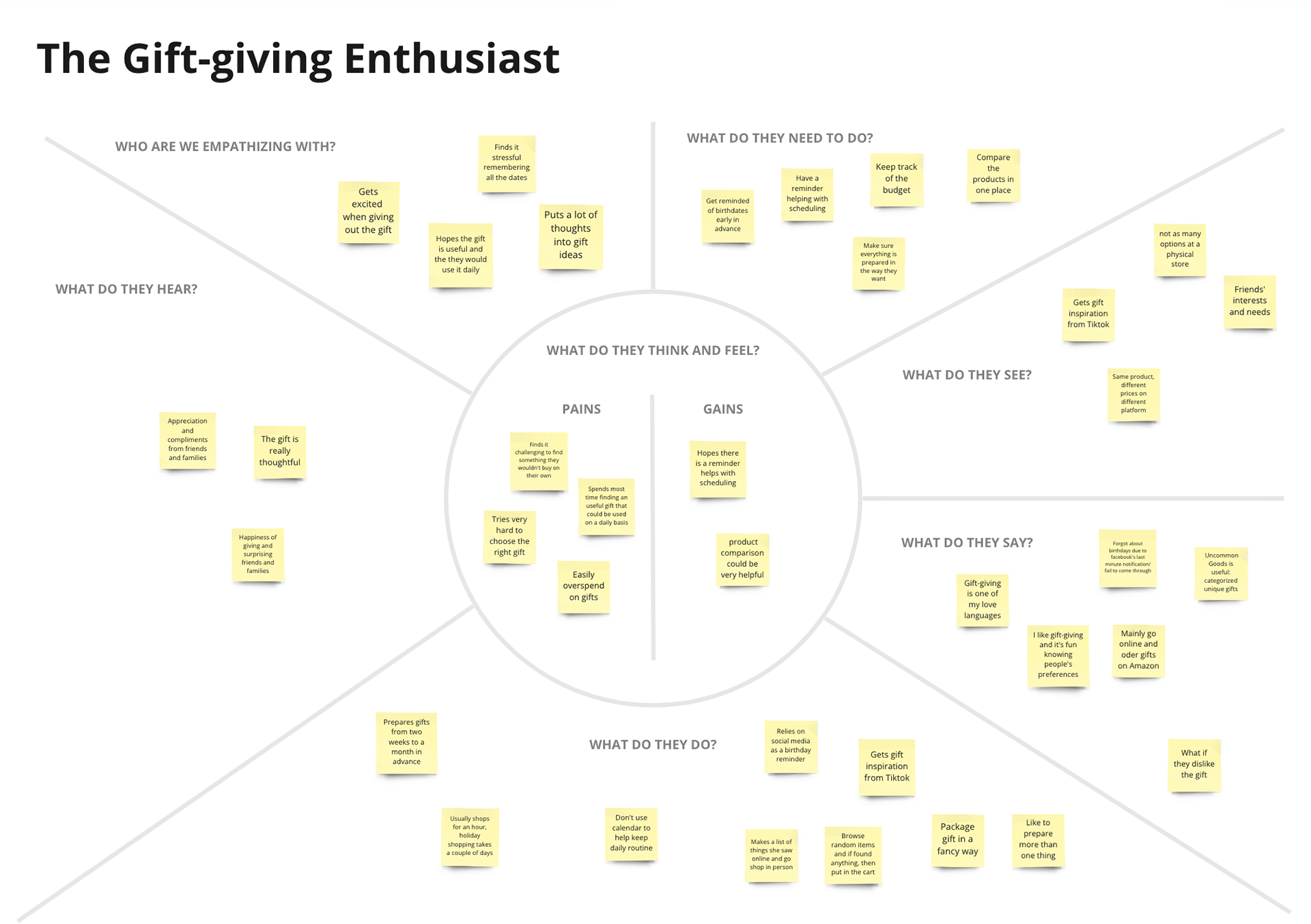
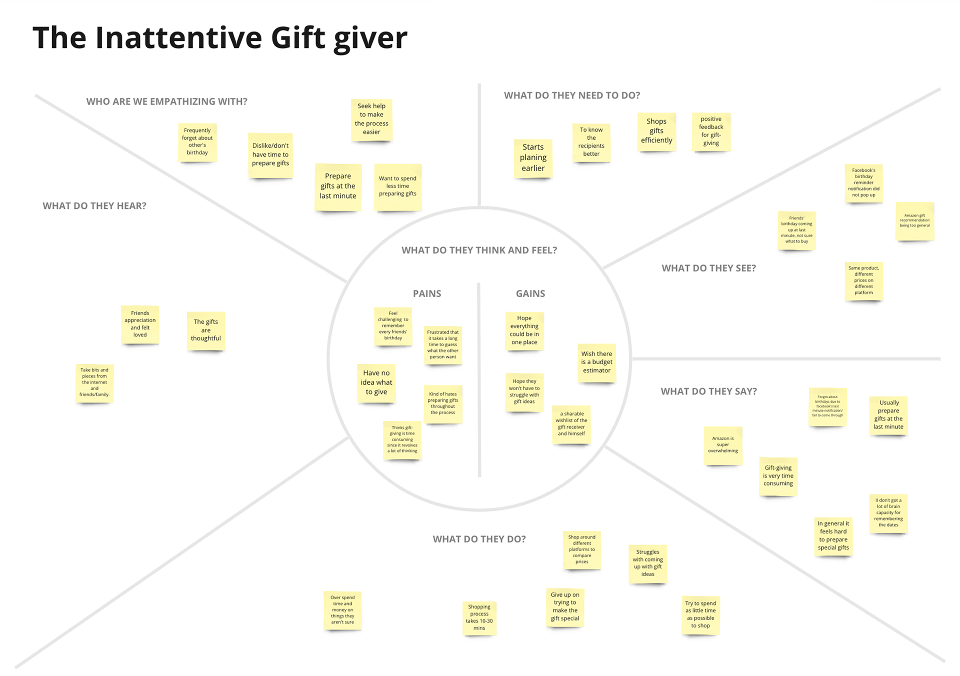
Empathy Map
Affinity maps were then categorized into three empathy maps: the gift-giving enthusiast and the inattentive gift-giver, and the diffident gift-giver.

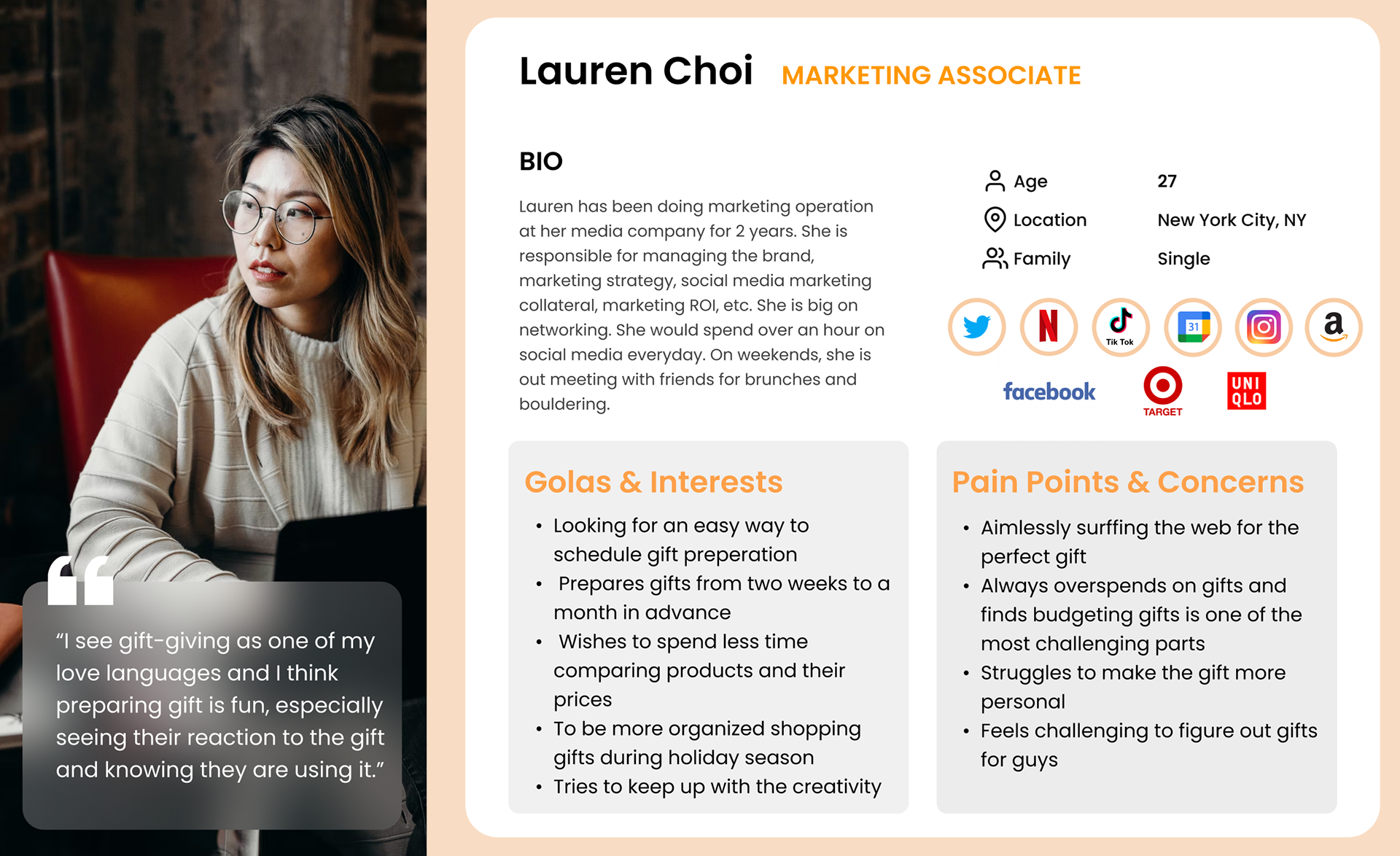
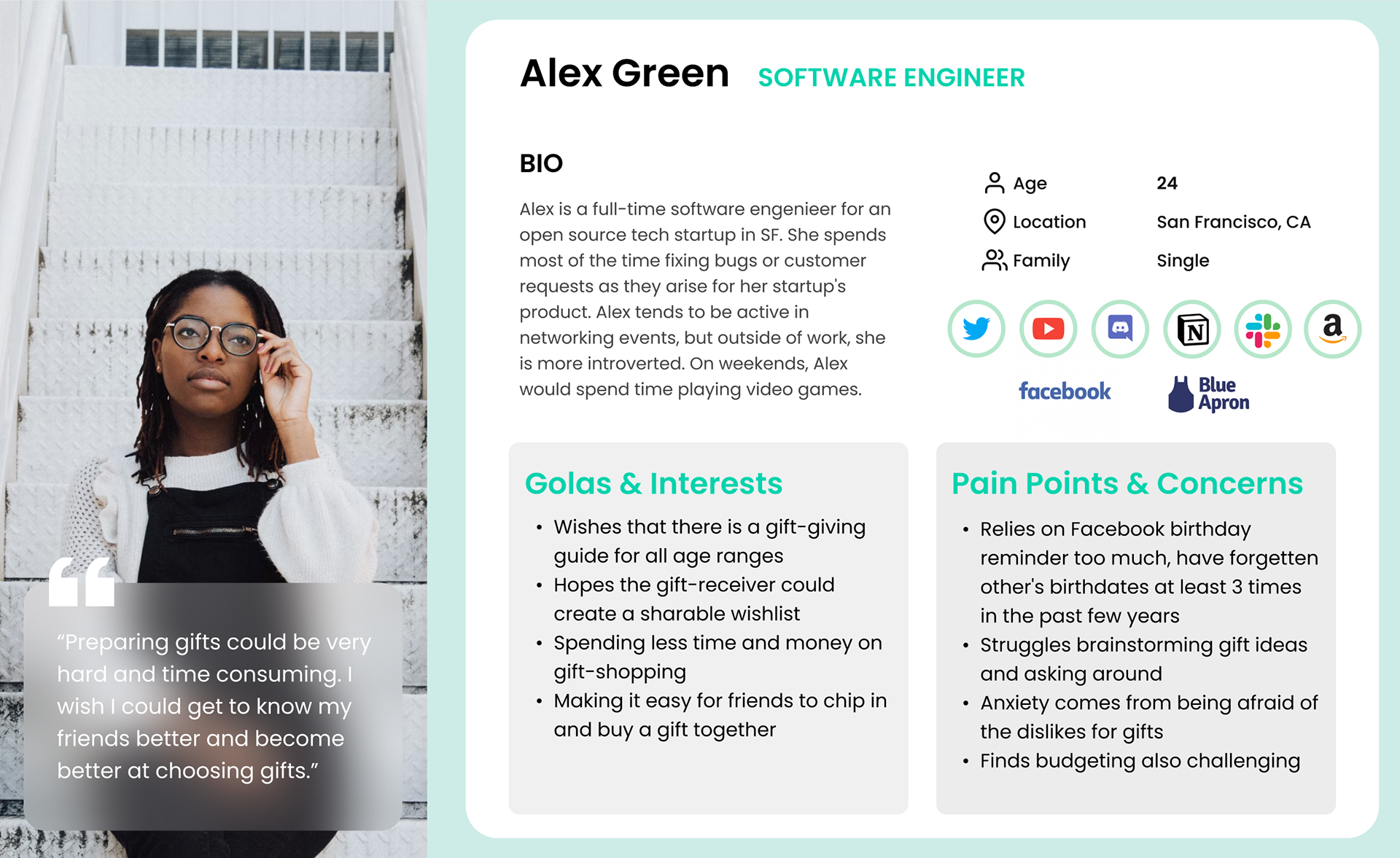
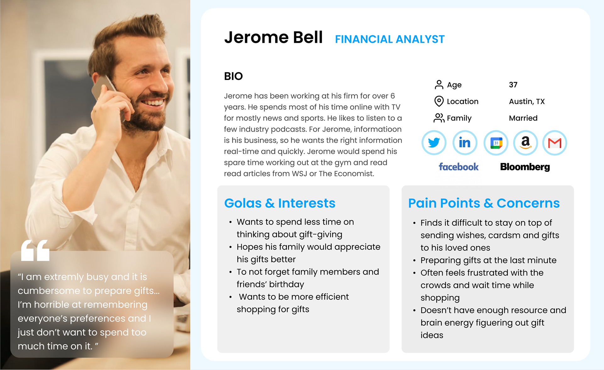
Personas
After a deeper look into both empathy maps, I created 3 personas:
· Lauren is a gift-giving enthusiast: the social butterflies regard gift-giving as one of their love languages.
· Alex is the diffident gift giver: those who want to give better gifts but find gift-giving time-consuming.
· Jerome is the busy inattentive gift giver: those who don’t want to spend time on gift-giving.
HMW’s
The final piece of my research was to synthesize this data, with How Might We (HMW) statements to clearly communicate the most important problems users want to solve.
· How might we relieve the difficulties of remembering occasions and avoid preparing gifts at the last minute?
· How might we relieve people's sense of being overwhelmed when they try to come up with gift ideas?
· How might we alleviate the inconvenience of searching for the perfect gift for loved ones?
· How might we optimize the spending for personalized gifts?
2. Ideation
All the research and synthesis provided me with enough insights to start sketching to generate ideas and establishing concepts to tackle users’ problems.
User Stories
User stories allow me to build a common language and a mental model of what this project is. User stories help me empathize more with the target groups. With the user stories, I then started working on the MVP (Minimum Viable Product) by sorting the stories from highest to lowest priority to create fundamental values for users.
High Priority - Must Have
· Know my loved ones’ birthdays and important events ahead of time
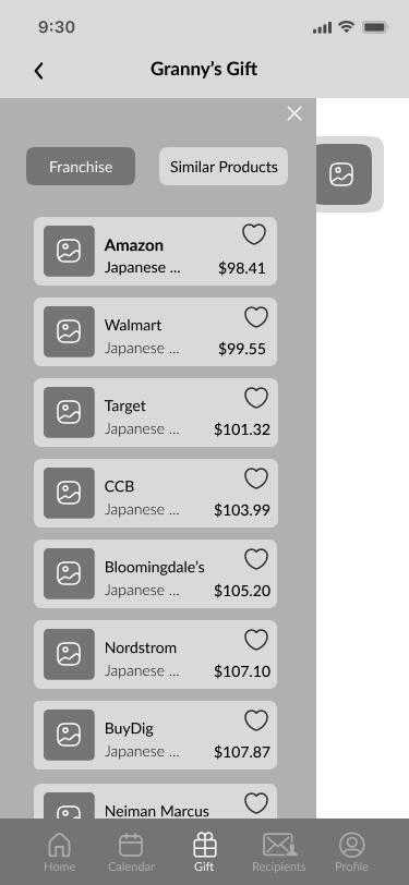
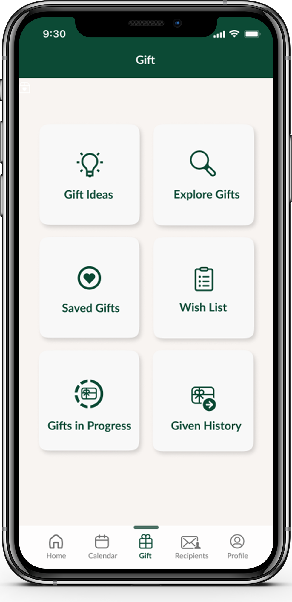
· Compare products at the same place
· Synchronize contact information
· Track the gift preparation process
Medium Priority - Nice to Have
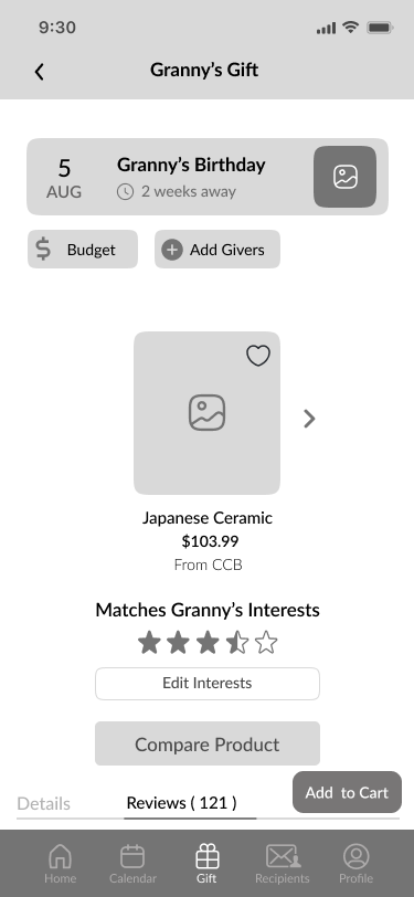
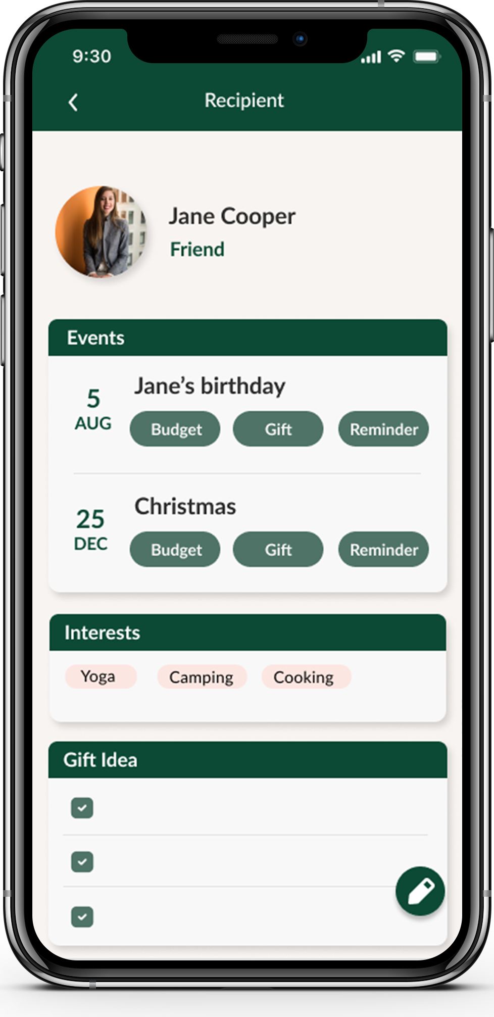
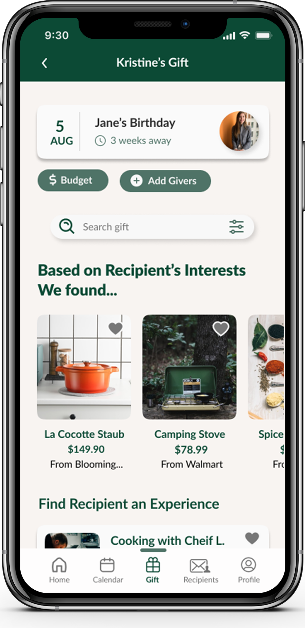
· Know the recipients’ interests
· A gift idea list to take notes and record gift ideas
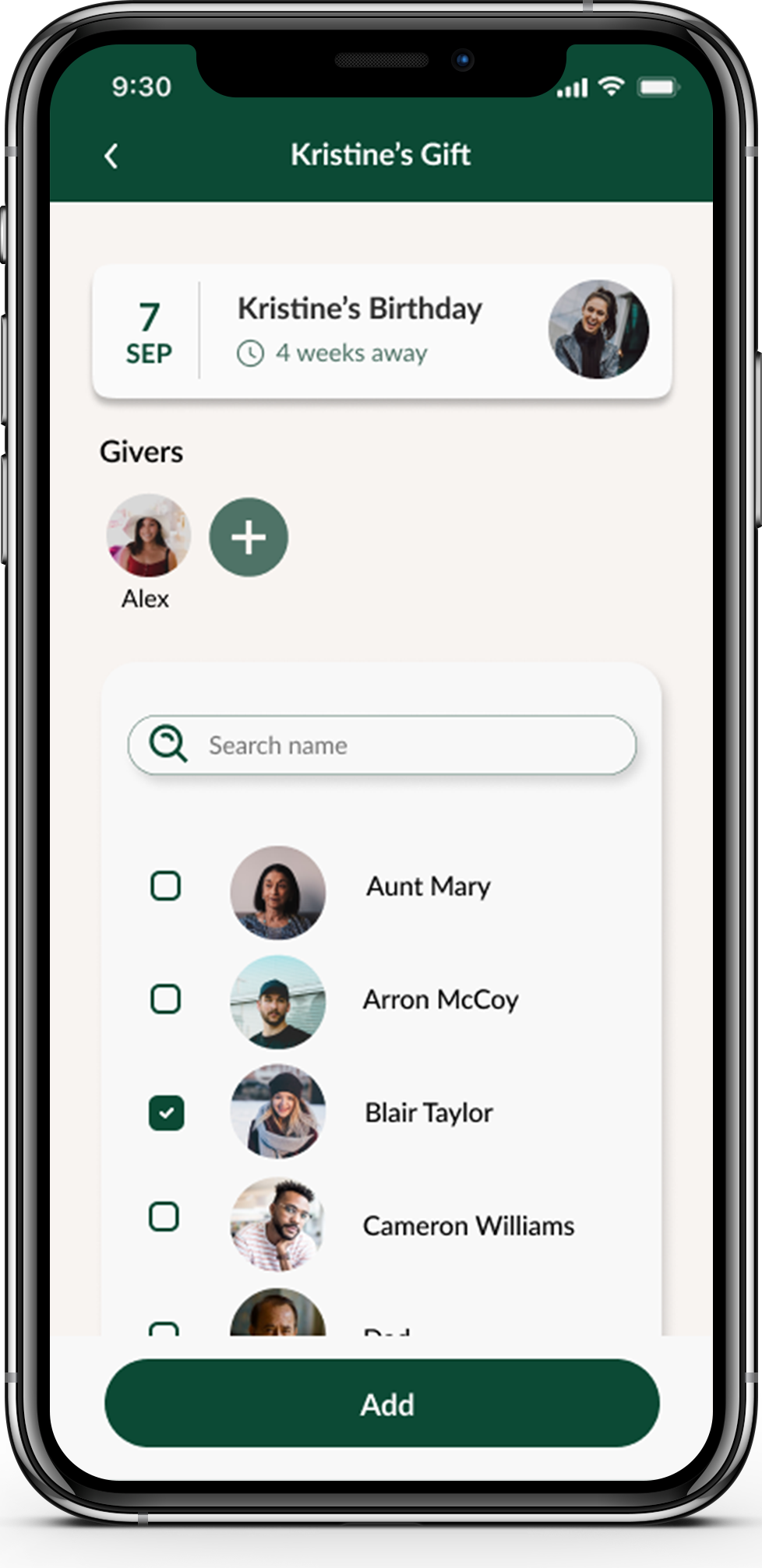
· Decide and prepare gifts for the recipient together with other gift-givers
Low Priority - OK to Have
· Estimate how likely the recipient is going to enjoy/ use the gift
· Able to return and exchange the gift products easily
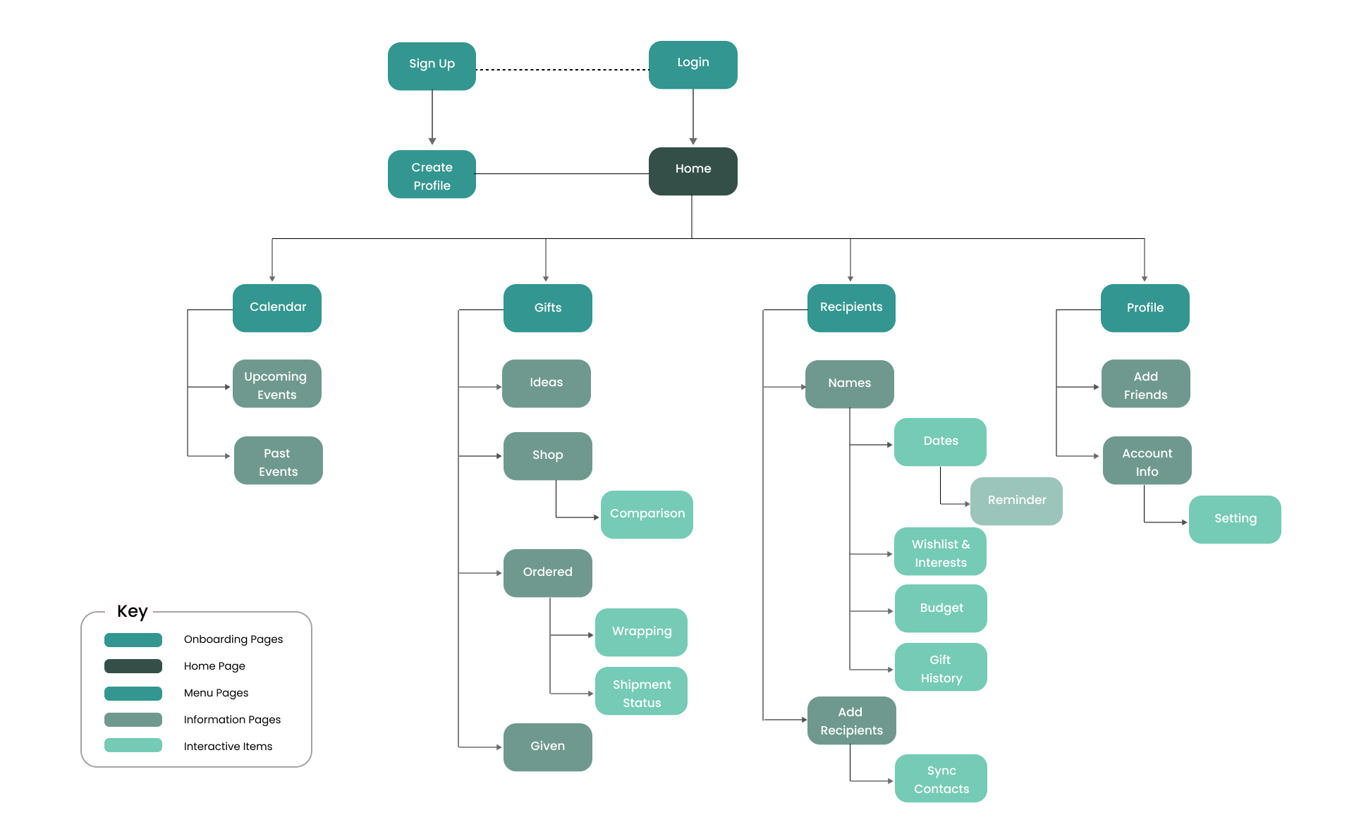
Sitemap
After creating the User Stories, I had a better sense of the information that should be included for the users. I developed a Sitemap with the basic functionalities and key features of the app.
User Flows
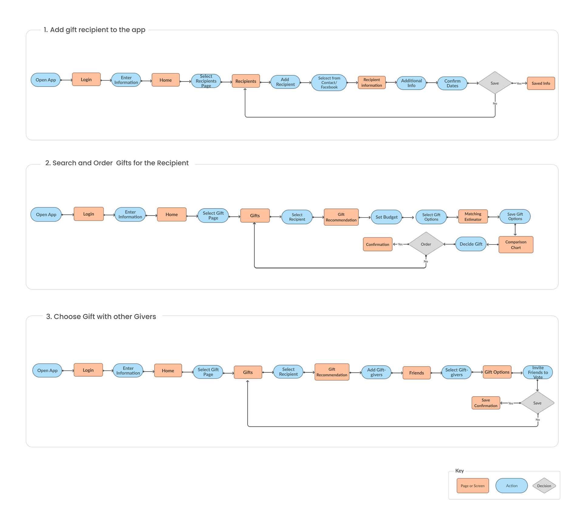
Developed upon the Sitemap, I identified 3 User Flows or Red Routes to provide step-by-step solutions for the interviewees' problems. Creating User Flows helped me to clarify how users can achieve their intended goals through designed interactions.
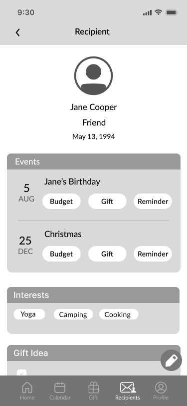
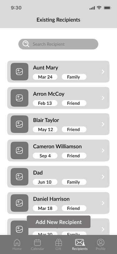
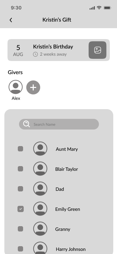
1. Add a Recipient to the app
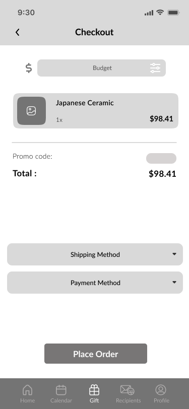
2. Search and Order a Gift for a Recipient
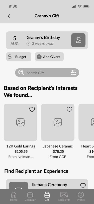
3. Choose a Gift with other gift-givers
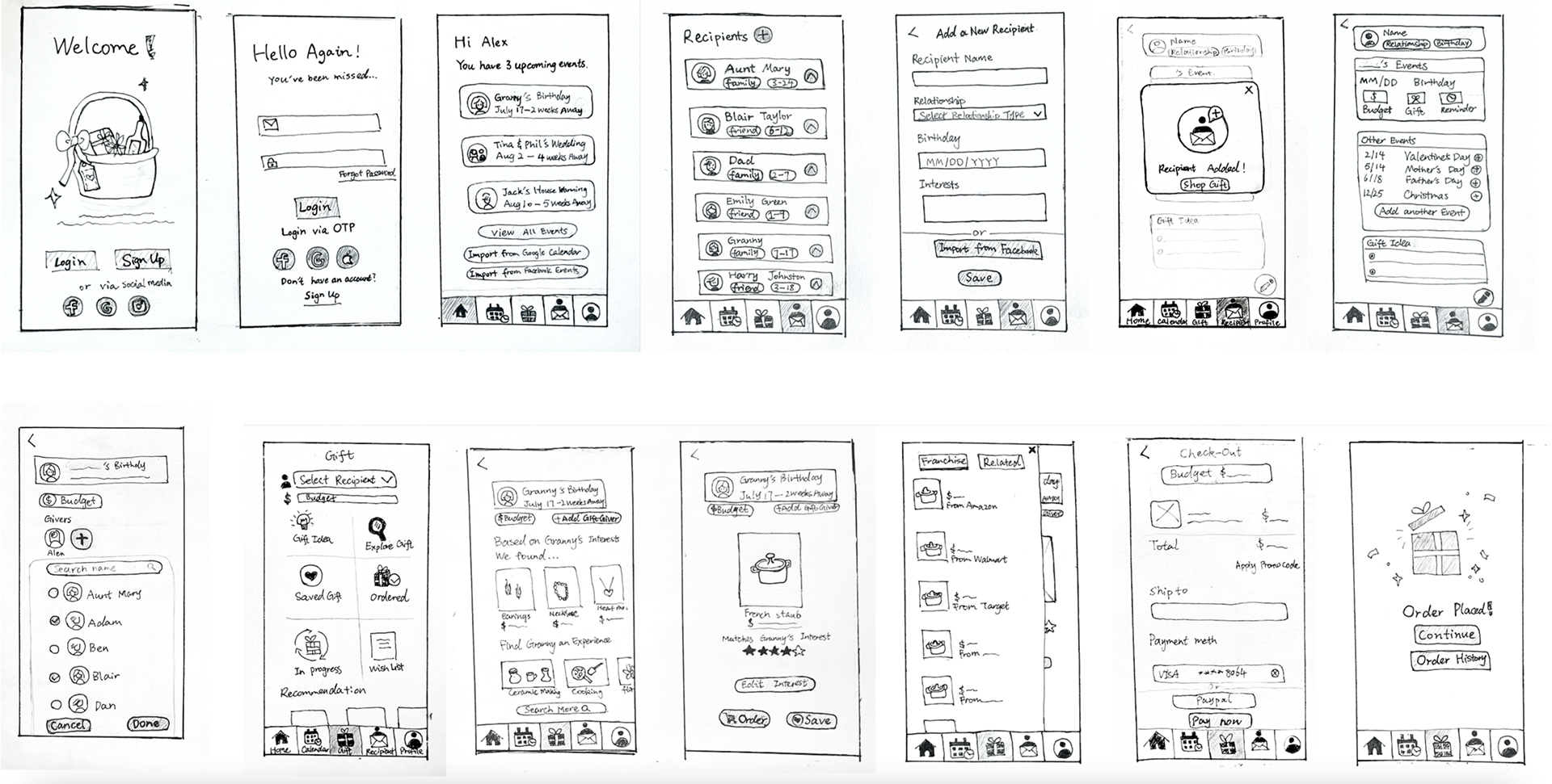
3. Sketching
Using my User Flows, I then started sketching the screens with pen and paper. This allowed me to visualize the initial ideas and to try out a multitude of ideas of the interactions creatively.
4. UI Design & Prototype
Low Fidelity Wireframes
Based on my sketches, I then created the Low-Fidelity Wireframes for the app in Figma to have a clearer vision of what the app might look like. Throughout the process, I was able to reconsider the structure of the screens and deliberate how to prioritize some of the interactions for the users.


Style Guide
Now that the app has a flow and structure to it, I wanted to keep the style minimal. Since this is a gift-giving app, I decided to go with a natural tone that reflects the genuine and warm quality. The use of rounded corners and the color palette deliver a sense of welcome and friendliness.


High Fidelity Wireframes
The main goal of the design process was to make a simplistic experience for users to follow and enjoy the journey of caring for their plants. I made a few changes along the way allowing me to make better use of space and re-construct certain aspects of the app.


5. Usability Test & Synthesize
Usability tests
I was ready to test the app and conduct usability testing. I wanted to evaluate not only how users would complete tasks, but the design as well as how they would navigate throughout the app. I reached out to 5 participants to conduct the usability testing sessions.
Test Objectives
· Understand users’ overall impression and experience while using the app in regards to use and style
· Uncover usability problems in Red Route
· Discover if users can navigate and interact with the app as intended
· Will users understand how to exit the search engine and return to the main screen?
Tasks
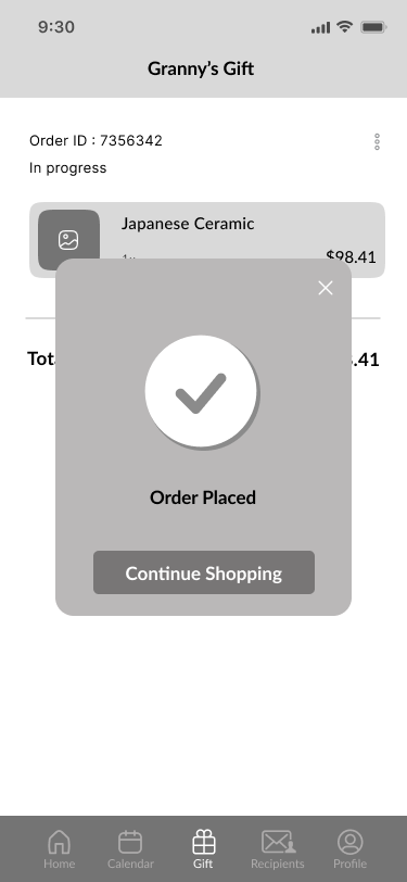
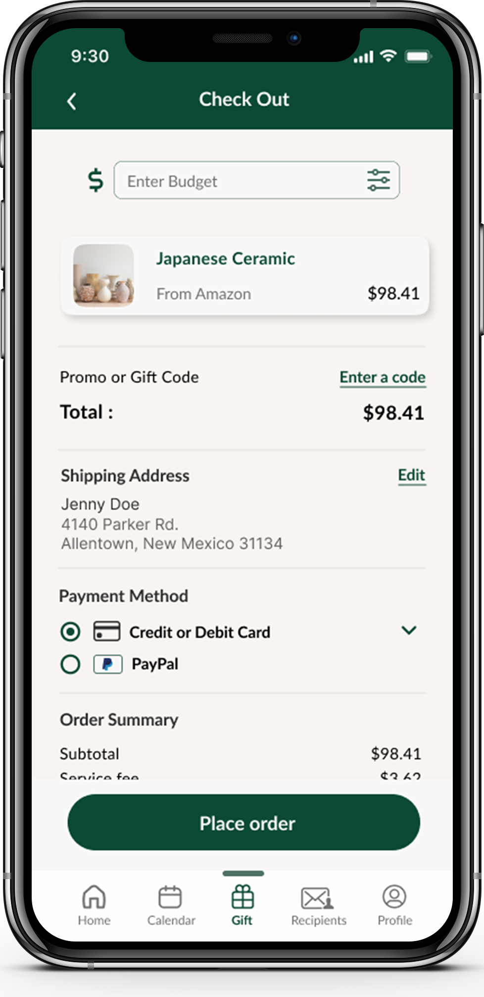
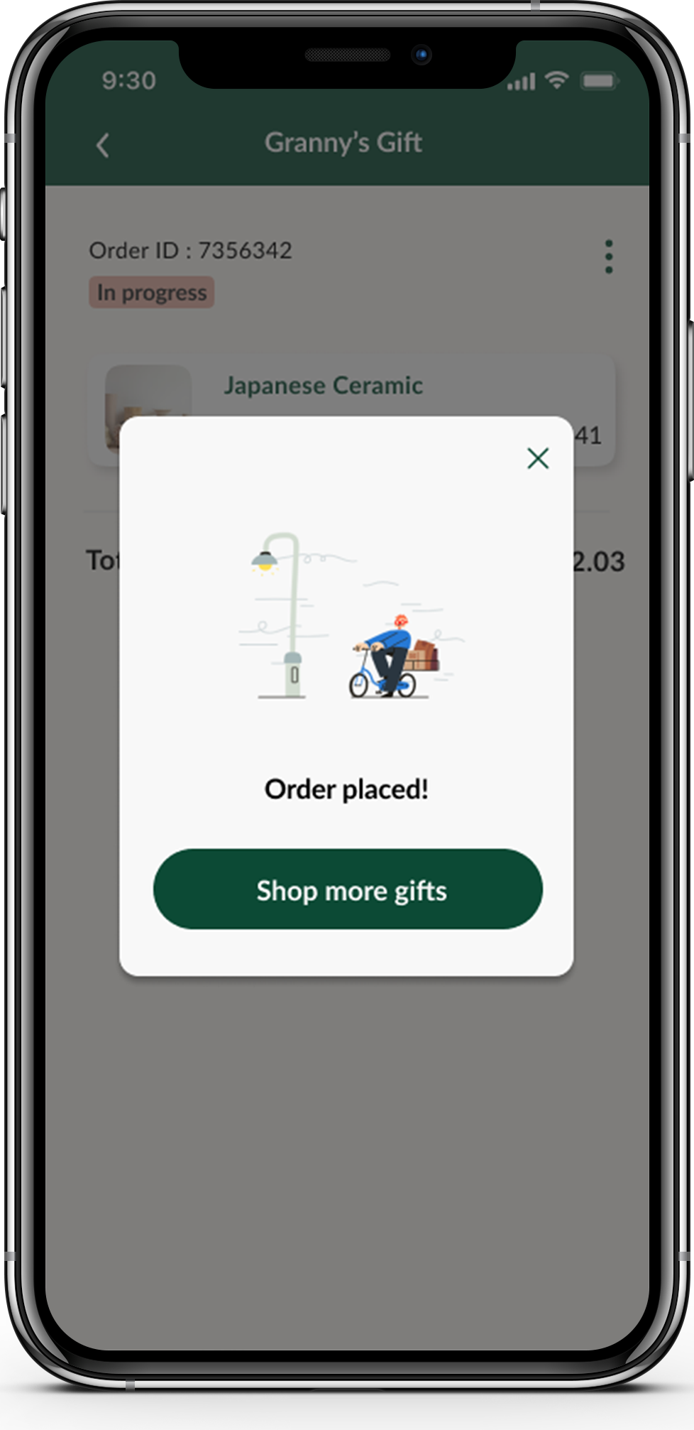
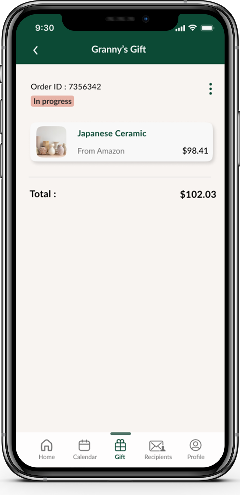
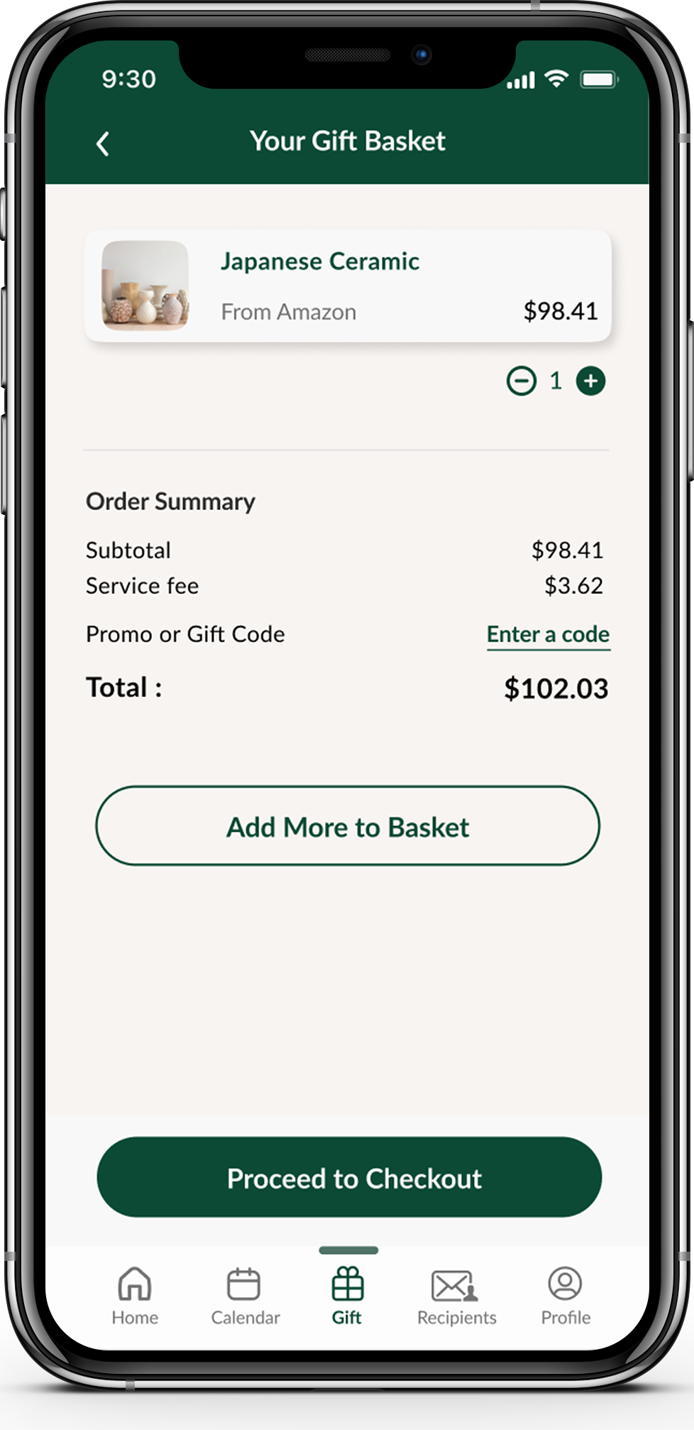
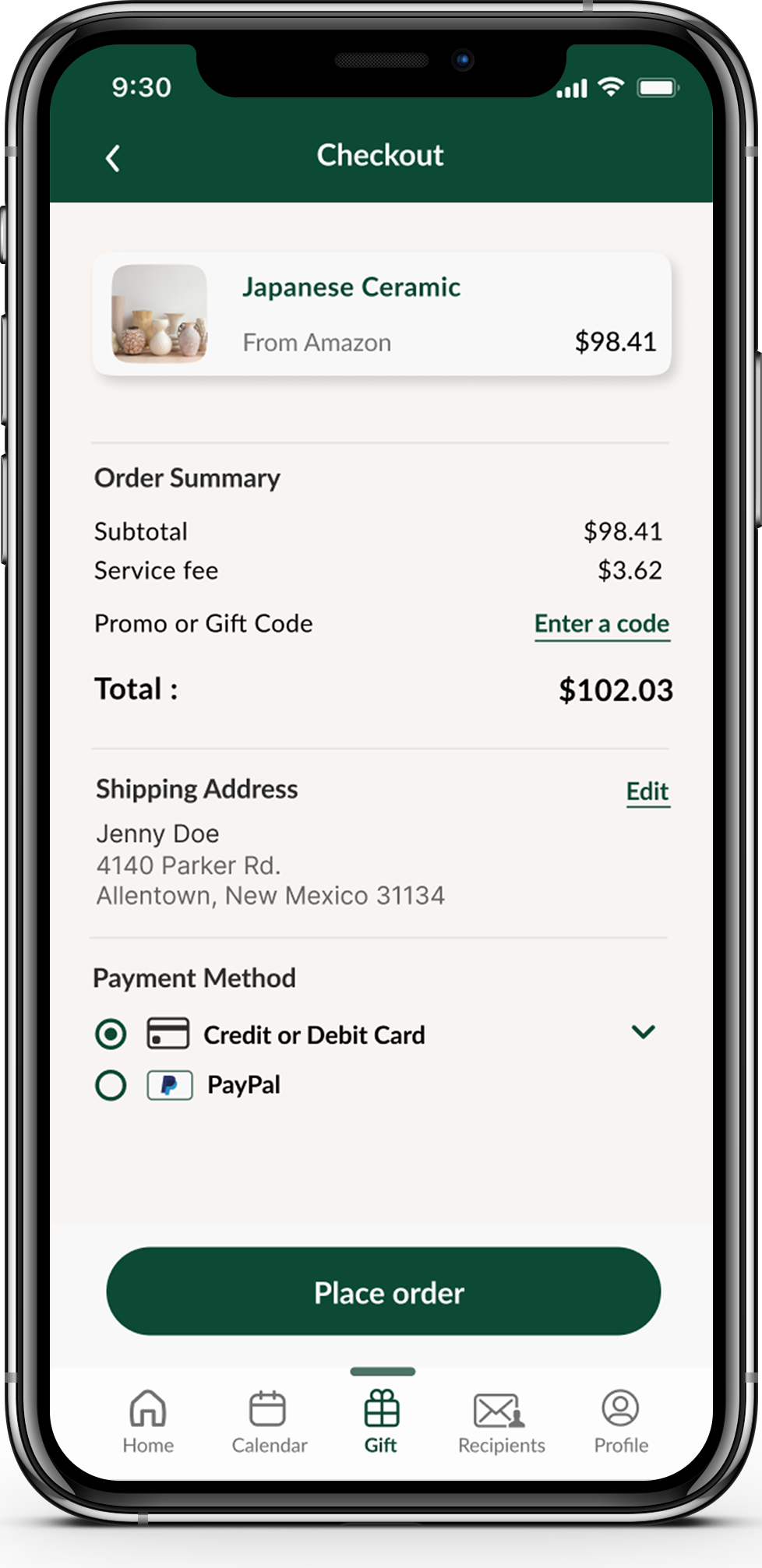
1. Complete the gift-checkout process
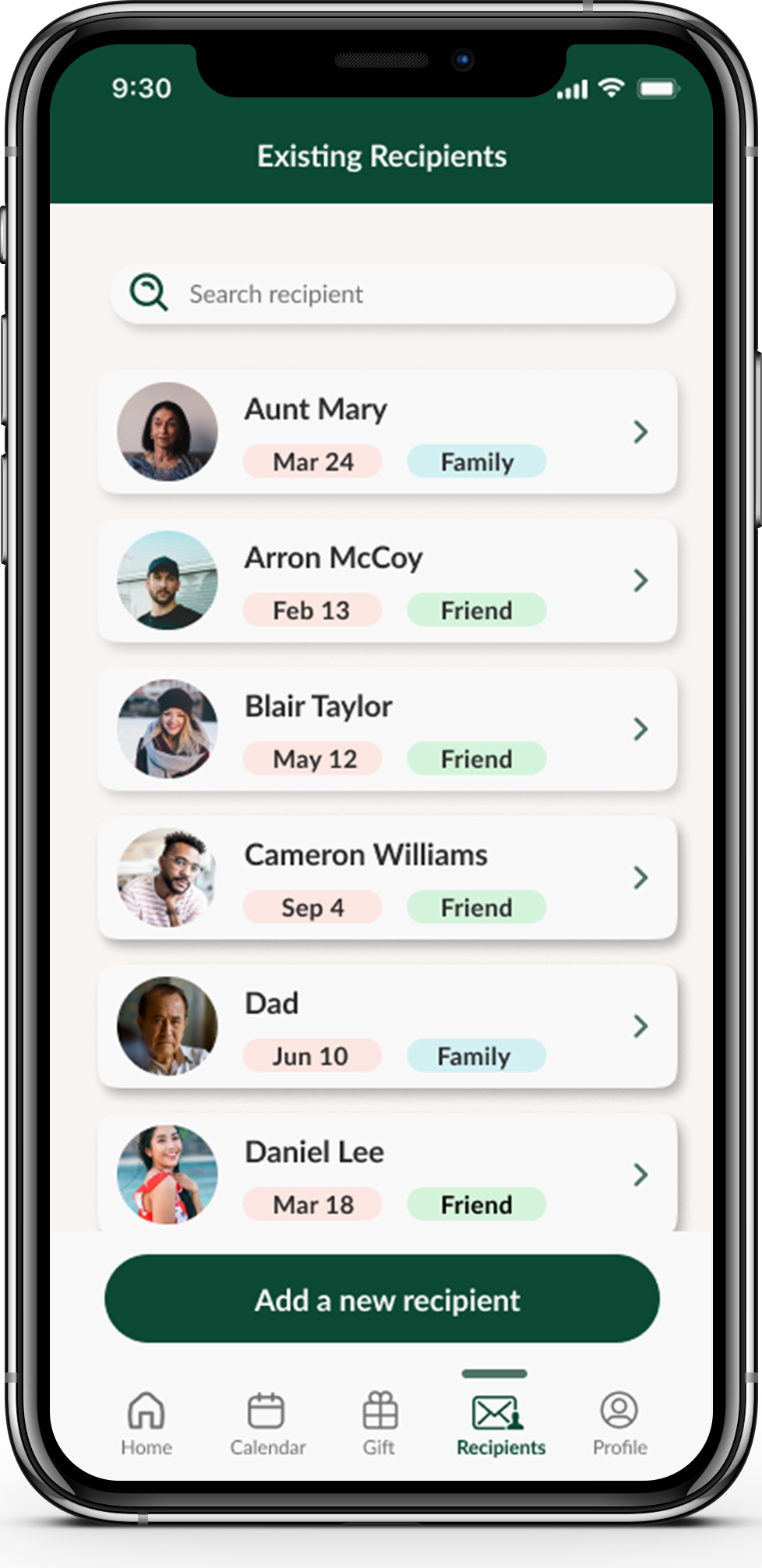
2. Add a new recipient
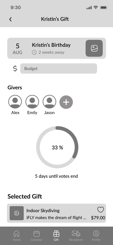
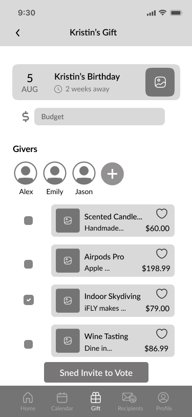
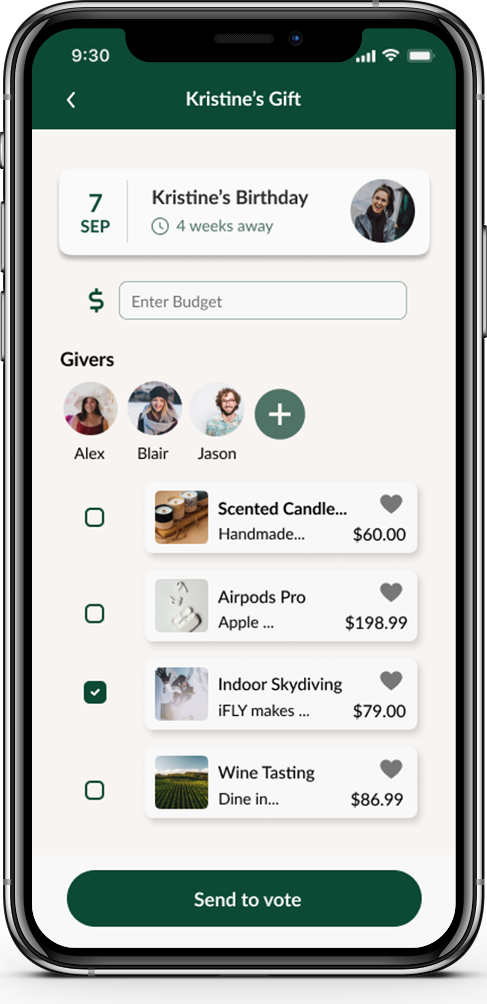
3. Select a gift for the event and invite other gift-givers to decide the gift
Testing Results
Through conducting 5 Moderated Remote Usability Testing sessions with 5 different participants online through Zoom, I was able to understand users’ overall impression and experience while using the app in regards to use and style, discover if users can navigate and interact with the app as intended, uncover usability problems in 3 Red Routes: purchasing a gift for Granny, adding a new recipient, and adding other gift-givers to vote gift for a recipient.
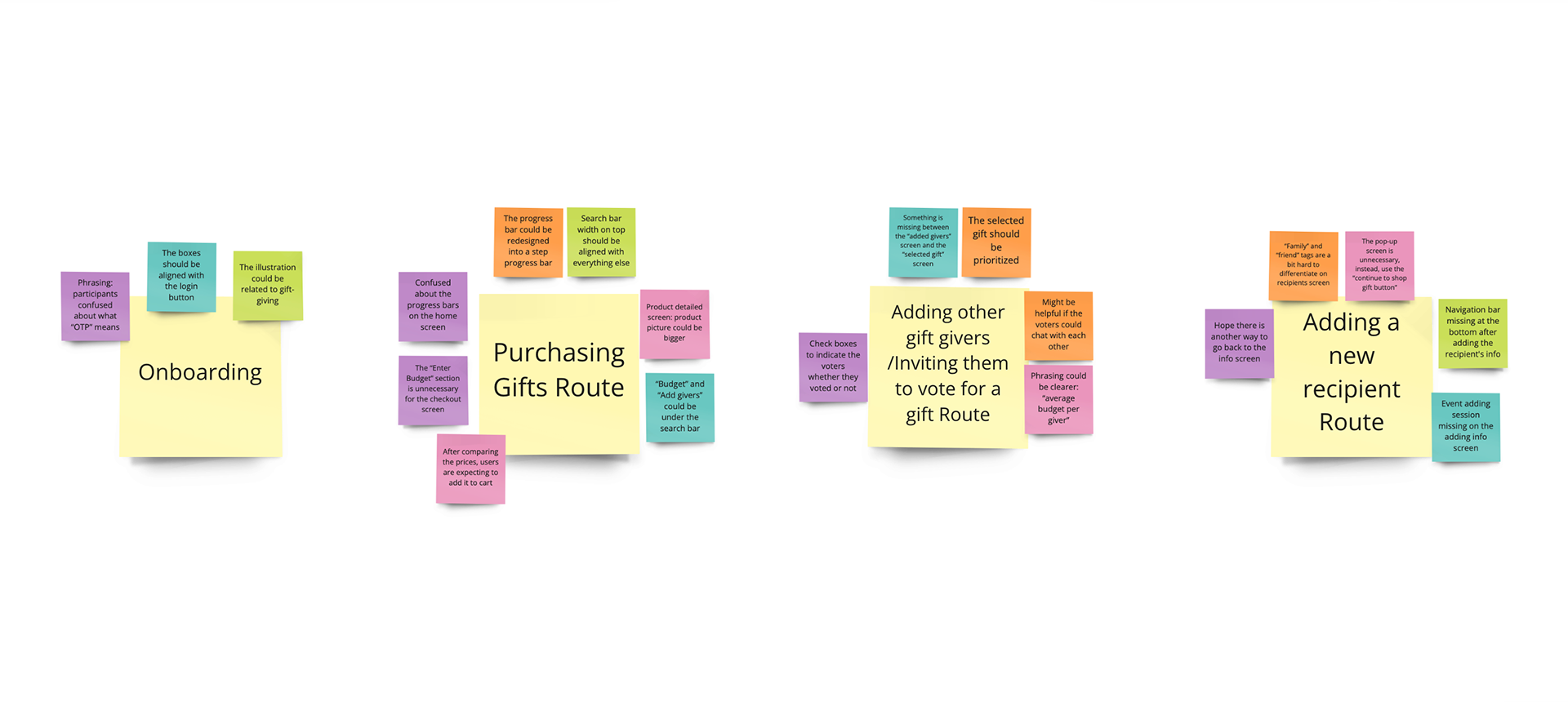
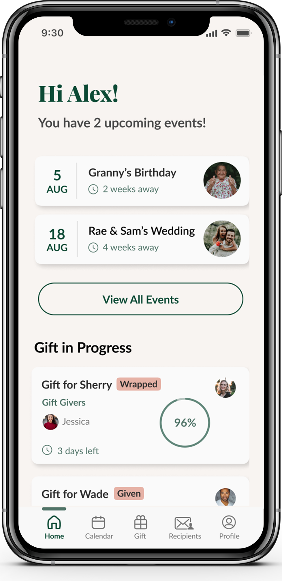
Issue 1- Progress bar on the Home screen is unclear
Summary
· Participants felt confused when they saw the progress bars under “Gift Progress”
Solution
· Have a step progress bar with title/ indication instead of the circled progress bar
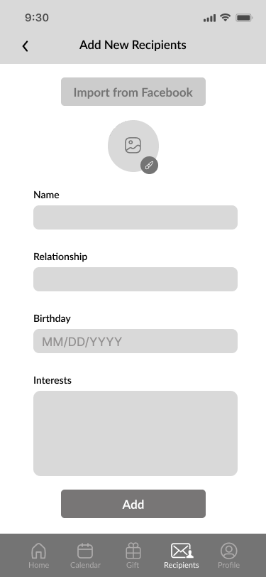
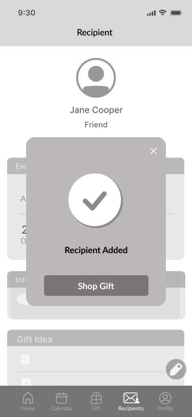
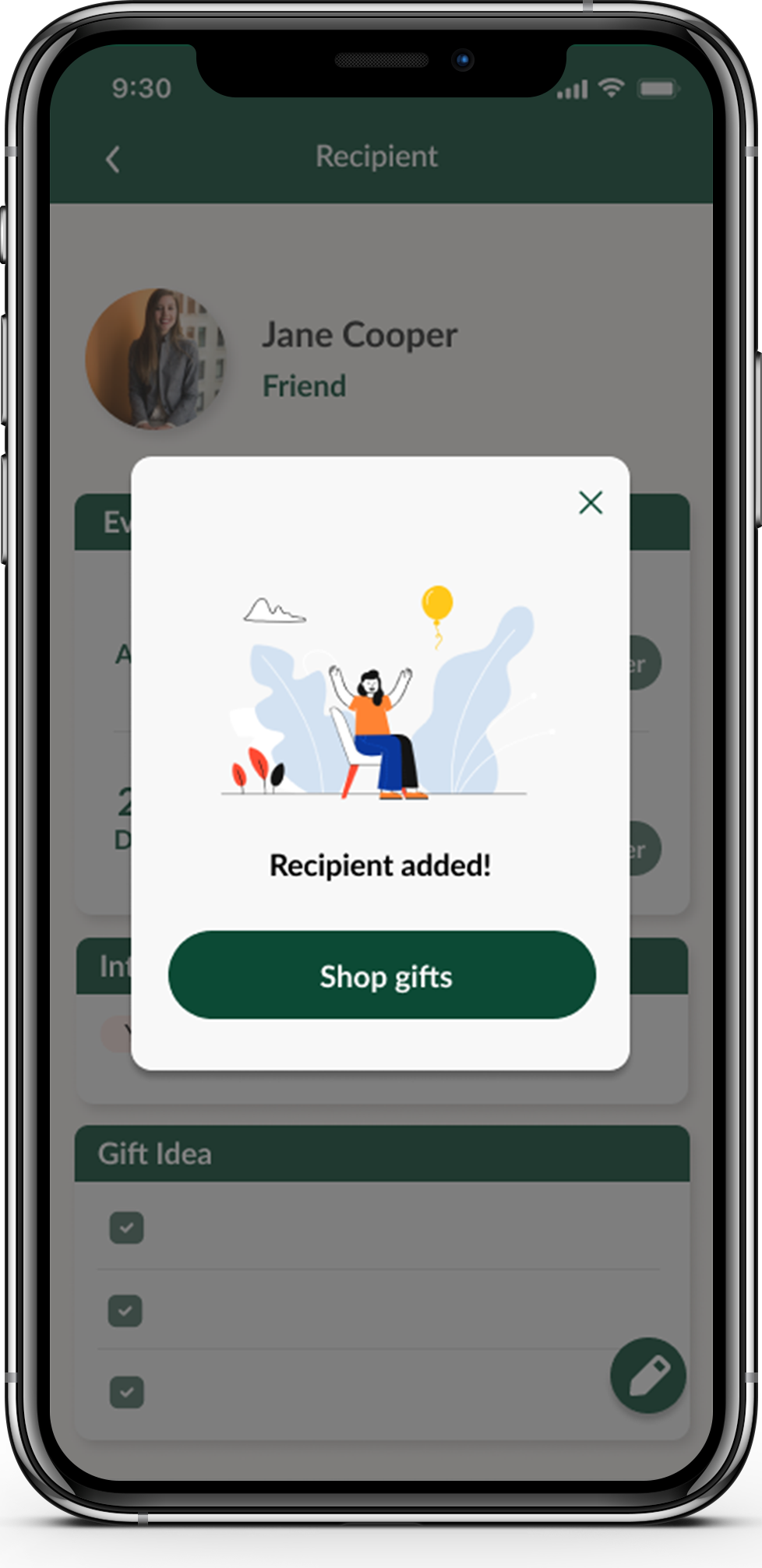
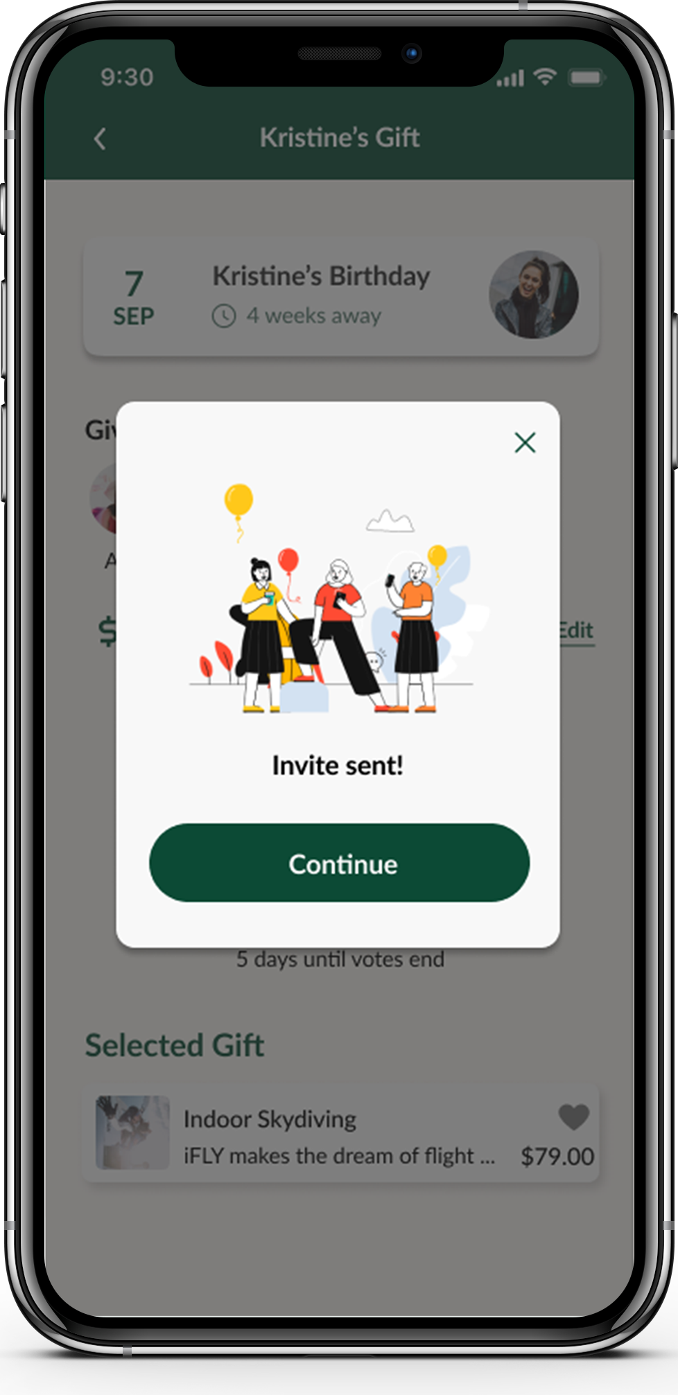
Issue 2 - Could not find a way to go back to the recipient’s info screen after adding the new recipient
Summary
· “Recipient added” pop-up window is confusing and participants think is unnecessary
· Participants wish to see the added recipient’s info screen right after editing the information
Solution
· Delete the “recipient added” pop-up window, the recipient’s info screen will be shown after the recipient's information is added; add a “shop gift” button and the navigation bar to the screen.
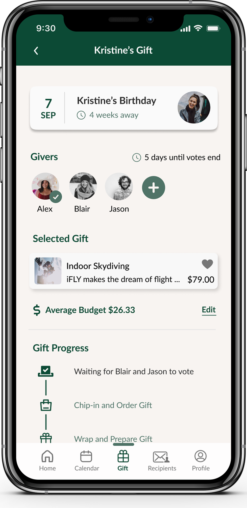
Issue 3 - The gift progress screen’s features are not clear
Summary
· Participants found that the selected gift should be prioritized
· Participants found it not clear if the voters have voted
· Participants got confused about the meaning of “average budget”
Solution
· Have “selected gift” on the top of the screen, right under the recipient
· Have check boxes right next to voters to indicate whether they have voted or not
· Rephrase “average budget” as “average budget per giver”
Redesign
It was very insightful to observe users interacting with the app prototype. All participants thought it was overall a straightforward experience. After gathering all participants' feedback I was then able to redesign to arrive at my final UI design.

Conclusion
As the sole UX designer for this project, I have learned a lot every step of the way. Doing research, conducting usability tests and designing iterations helped me to understand how to design to meet the users’ needs. Initially, I want this product to provide a sense of inspiring, exciting, versatile, creative, caring. It was rewarding to develop these concepts into a user-friendly product. I was not only studying how to create minimalistic UI design through out the process, but also getting the mindset to consider accessibility when making design decisions.
Looking forward, I would like to keep developing this product with additional user research.It would be nice to have:
· A social feature that allows users to connect through
· Helping center to provide more instant help